


|
0
days
0
hours
0
mins
0
secs

Sometimes your drawings don’t turn out as you’ve imagined them to be and you aren’t satisfied with the result. But it’s not always because of a lack of drawing or artistic skills. Many times it’s simply because you’ve made the wrong color choices.
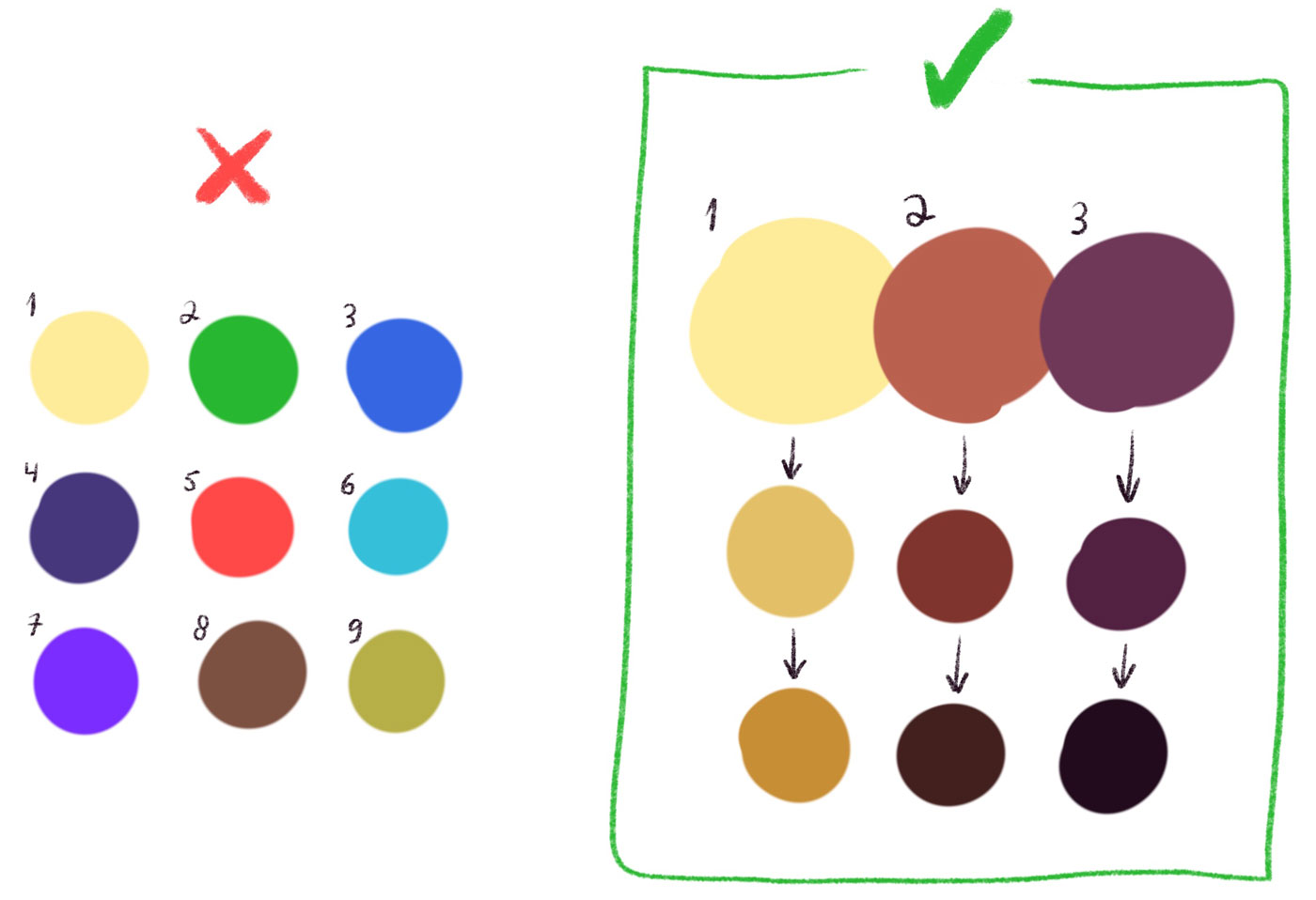
Using too many colors might be bad for your digital art. When using a large amount of different tones you might end up with a messy result that looks childish, generic and flat. I’d recommend going with 3-5 different tones, and play with their brightness. A restricted and minimal color palette will give your artwork a unique atmosphere. It’s basically like spices when cooking, you don’t want to have too many different flavors.
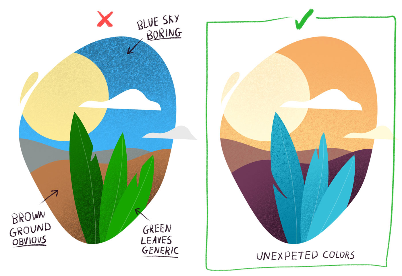
A common mistake that I’m seeing a lot among beginner artists is the predictable choice of colors. From a young age we’ve been taught that the sky is blue, the sun is yellow and plants are green. Those are exactly the assumptions that make most drawings childish and generic. It’s tempting to choose a color based on the realistic tone of the subject we’re drawing. But you’ll be surprised to find how easy and rewarding it is to break these rules. Be comfortable to go with unexpected colors. For example, you can use orange for the sky, blue for leaves, and purple for skin tones.
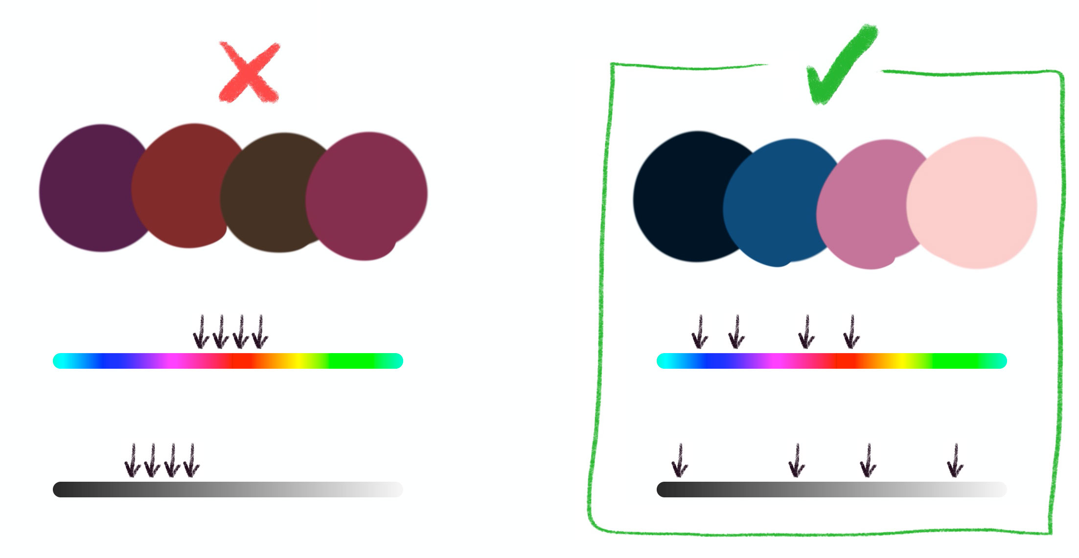
Contrast is a very important thing to keep in mind, especially when choosing colors from scratch. Good contrast creates the proper hierarchy between the different objects in your art. A common mistake is to choose colors that are too similar to each other. You should make sure your colors are different from each other at least by their hue and their brightness.
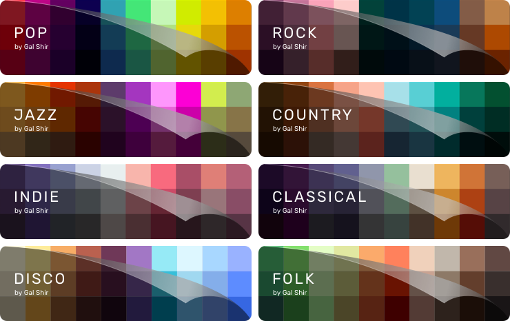
If you want to see more examples and get a complete set of color palettes, you should check out my Premium Color Palettes for Procreate and Photoshop. I’ve designed these palettes to fit any style of art, and all the colors are carefully selected to help you achieve unique atmospheres in your art.
Coming up with color palettes isn’t always intuitive and sometimes it takes hours to tweak and adjust the tones in order to achieve the perfect mix. So I hope you’ll find this tip useful!